Merging the city’s Byzantine architectural memory with a modern transportation system
Thessaloniki Metro
Helliniko metro –
Proposal for the National Logo Design Competioion
(Case Study)
Context & Objective
The Thessaloniki Metro is more than a transportation system; it is a long-awaited civic project deeply intertwined with the city’s history, identity, and daily life. The objective of the logo design was to create a strong, timeless, and immediately recognisable visual symbol that would unify Metro and Thessaloniki into a single, coherent identity — legible both to residents and visitors, and capable of functioning across infrastructure, wayfinding, and public space.
Conceptual Foundation
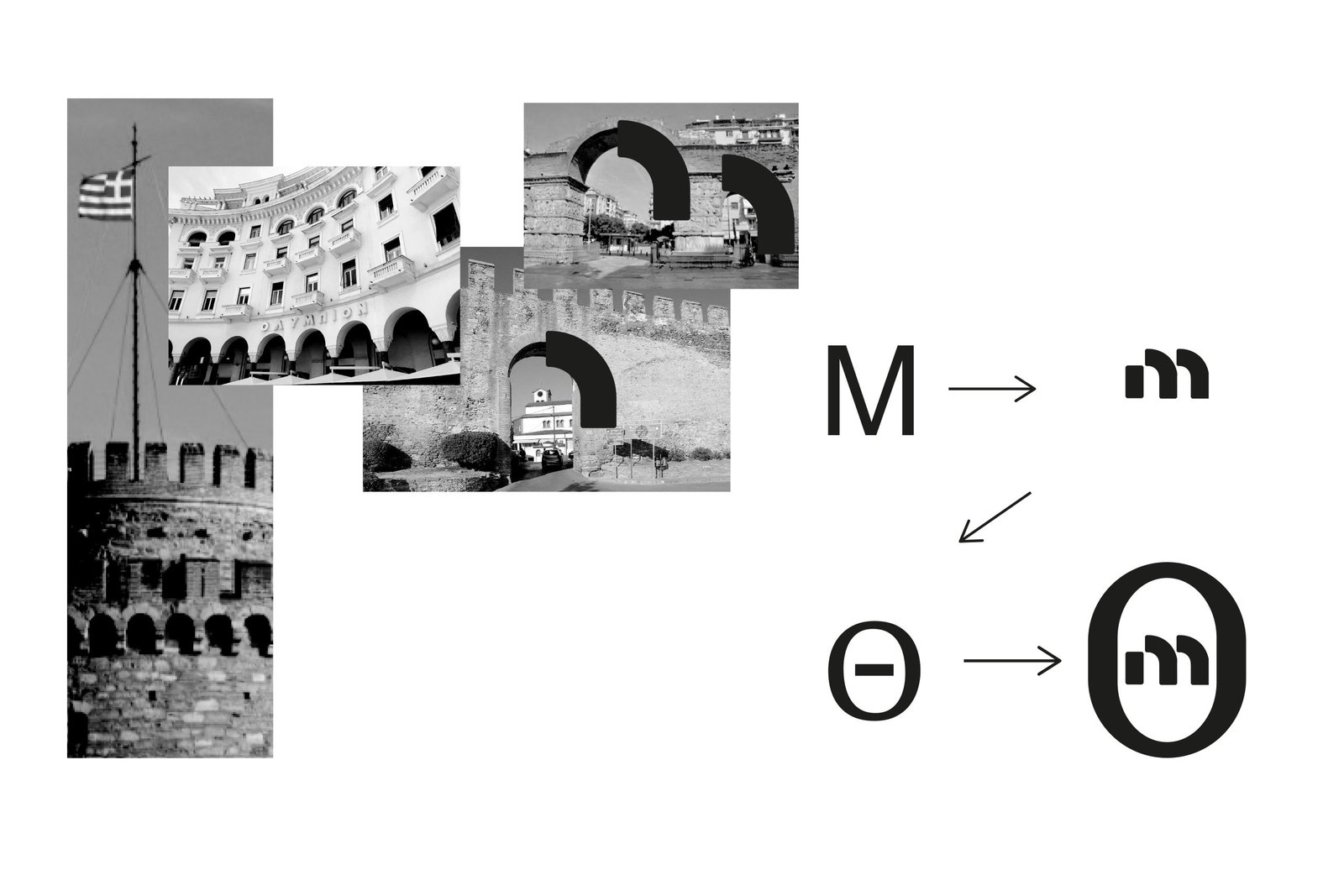
The logo is based on the conceptual synthesis of the initials “M” and “Θ” (Metro Thessaloniki). Rather than treating these letters as purely typographic forms, they are used as architectural and symbolic devices, directly referencing the visual language of the city. The primary source of inspiration is Thessaloniki’s Byzantine architectural heritage — specifically the arches and arcades that define its urban image. These architectural forms are omnipresent across the city: from the White Tower, the Arch of Galerius, and the Rotunda, to the city walls and the arcaded façades of Aristotelous Square.
Letterform Design
The letter M (Metro) was custom-designed exclusively for this identity. Its form is shaped to echo the arched windows and vaults of Byzantine architecture, transforming a typographic element into an architectural reference. This approach allows the logo to function not only as lettering, but as a visual metaphor for the city itself. The coexistence of the two initials creates a compact, robust, and symbolic mark, where Metro and city become inseparable. The result is a logo that feels inherently local, yet formally restrained and contemporary.
Form & Structure
The final symbol is enclosed within a circular outline, reinforcing ideas of unity, continuity, and movement. This decision also establishes visual dialogue with the identity of Attiko Metro, ensuring consistency and coherence across Greece’s metro systems while allowing Thessaloniki’s identity to remain distinct. Both logos share a common visual philosophy:
– Typographic reduction
– Geometric clarity
– Restrained abstraction
– Use of initials as primary carriers of meaning
Colour Strategy
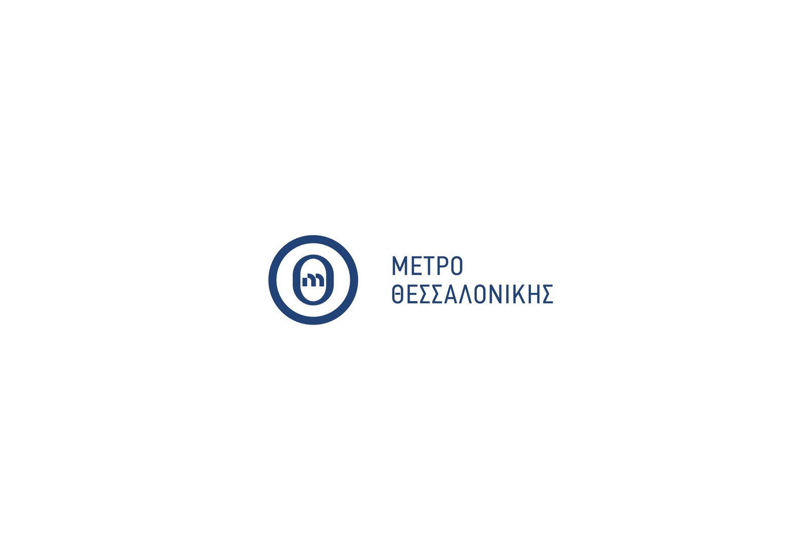
A deep blue was selected as the core colour of the identity. This choice reflects Thessaloniki’s natural landscape, where sea and sky converge, forming one of the city’s most recognisable visual constants. The colour reinforces calm, trust, and permanence — qualities essential for public infrastructure.
Functionality & Wayfinding
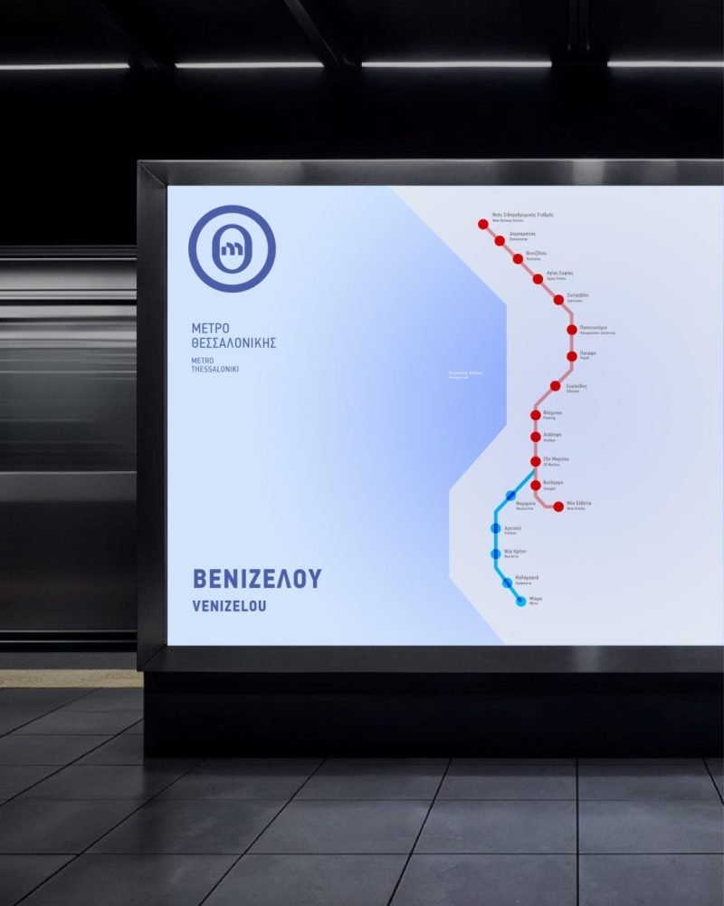
Beyond symbolism, the logo was designed with functional clarity at its core. It remains highly legible at multiple scales and performs effectively across:
– Station signage
– Urban wayfinding
– Maps and diagrams
– Columns, pylons, and architectural elements
– Digital and printed communication
Its simplicity ensures ease of recognition for both locals and international visitors, supporting intuitive navigation within a complex urban transport network.
Outcome
The Thessaloniki Metro logo operates as a visual bridge between past and present — merging the city’s Byzantine architectural memory with a modern transportation system. It is an identity rooted in place, culture, and collective experience, designed not as decoration, but as a civic symbol that belongs to the city and its people.