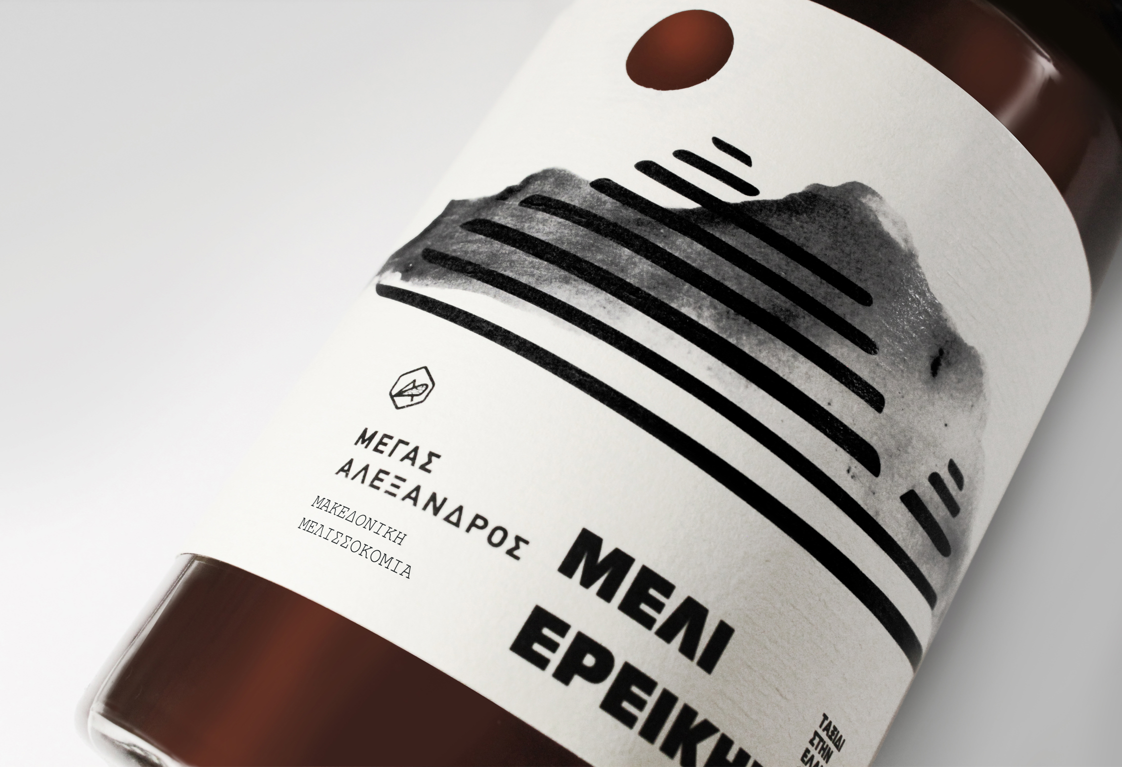
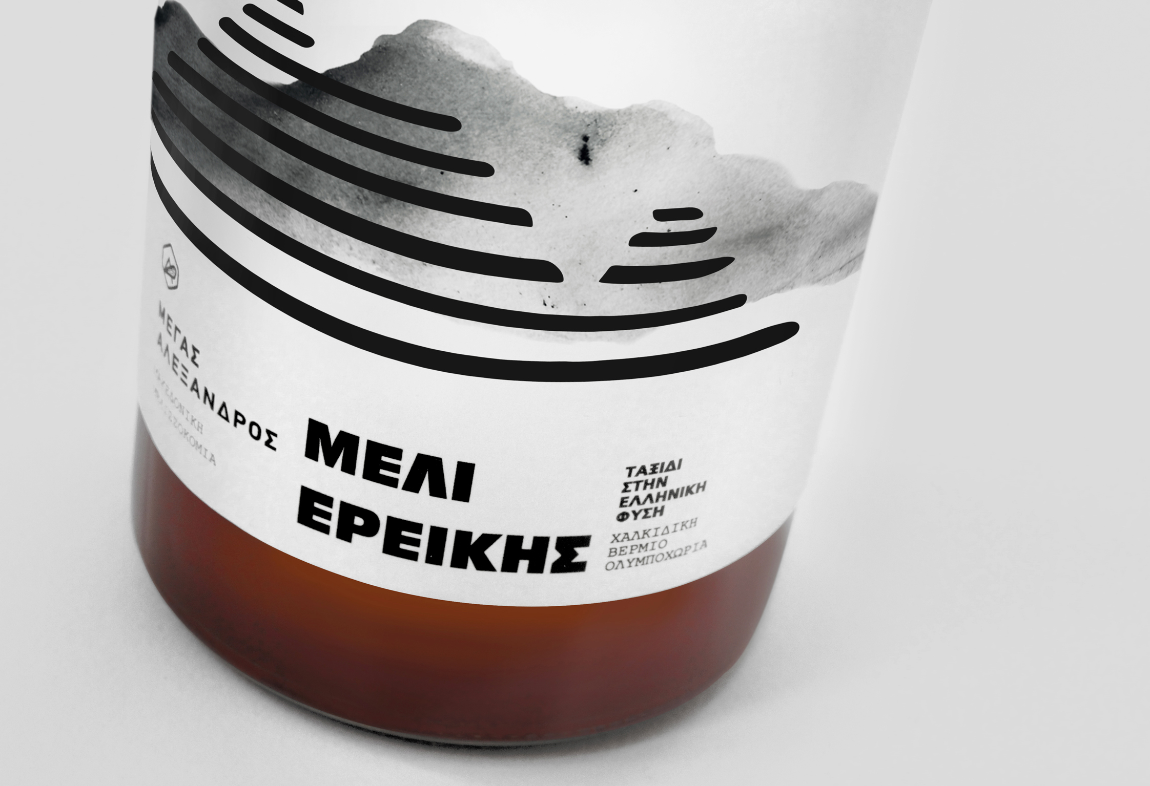
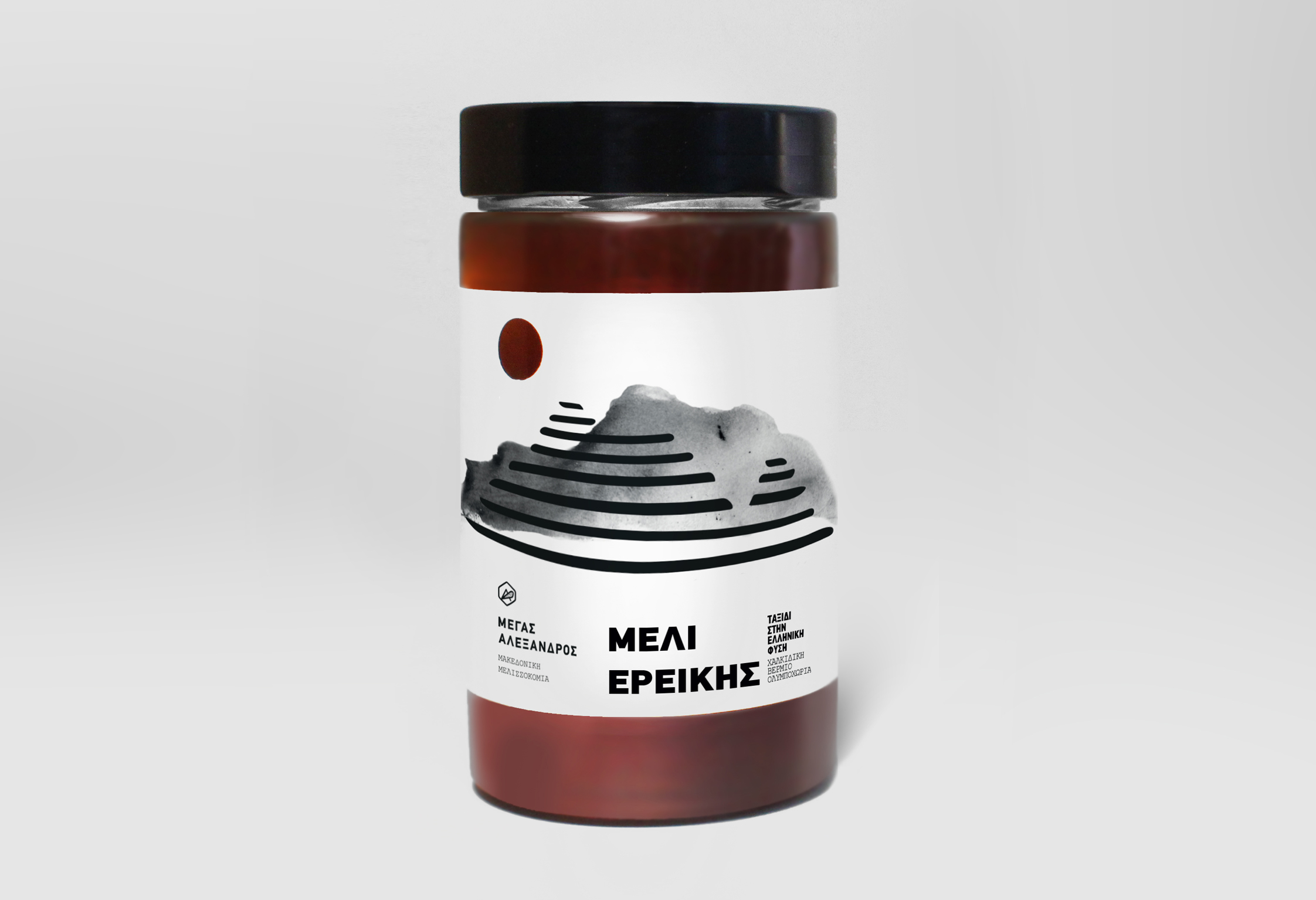
The label design is conceived as a quiet tribute to landscape, light, and natural balance. At its core sits a stylised illustration of Mount Olympus, rendered with restrained, graphic strokes that echo the mountain’s timeless presence and symbolic weight. Rather than a literal depiction, the mountain is abstracted into layered forms, allowing the label to feel contemporary while remaining deeply rooted in place.
A circular cut-out at the top of the label functions as a conceptual and physical gesture. It resembles the sun—the elemental force that nurtures Mount Olympus, the surrounding flora, and the bees themselves. As light passes through the opening, the warm colour of the honey becomes part of the design, reinforcing the idea that nature is not merely represented, but actively revealed through the product.
The minimal typography and generous negative space allow the illustration and materiality to breathe, emphasizing purity, craftsmanship, and authenticity. Together, the mountain and the sun create a subtle narrative of origin: land, light, and time working in harmony. The result is a label that feels honest, grounded, and poetic—reflecting both the quality of the honey and the philosophy of its makers.